Read the Label
Constraints, creative truths, and the most mundane masterpiece.

This year marks 25 years in video games, most of them spent finding my footing as an artist before landing where I am now: 12 years as co-founder of System Era, with 7 of those years as Creative Director where I get to envision and build sandbox games designed to be naturally playful with spaces that foster friendships. It’s work I love. Our latest game, STARSEEKER: Astroneer Expeditions is out in early access on all platforms this June.
I wrote a blog post about its development you can check out over here.
This, however, is not about the games I make but instead about an odd source of inspiration that typically influences me in abstract ways more than it does directly. The short version is that working with limitations produces the best work. But the long form of this is what it actually is, its history getting there, and a brief look at ways in which its affected my professional work on games like Astroneer and Starseeker.
The Nutrition Facts Label
That white box on the back of every food item you buy that outlines serving sizes and calorie counts before diving head first in to a dozen other facts about your food. For me, its the ultimate example of what people mean when they say, “the enemy of art is the absence of limitations” and that quote rings in my head when the ideas first spark and they’re their most nebulous, broadest form. What needs to be true and in what priority?
Quickly, though, before I dive in to the more abstract ways it can influence and inspire someone I want to acknowledge that it influenced me in a more literal way, too: the redesign of my personal website.
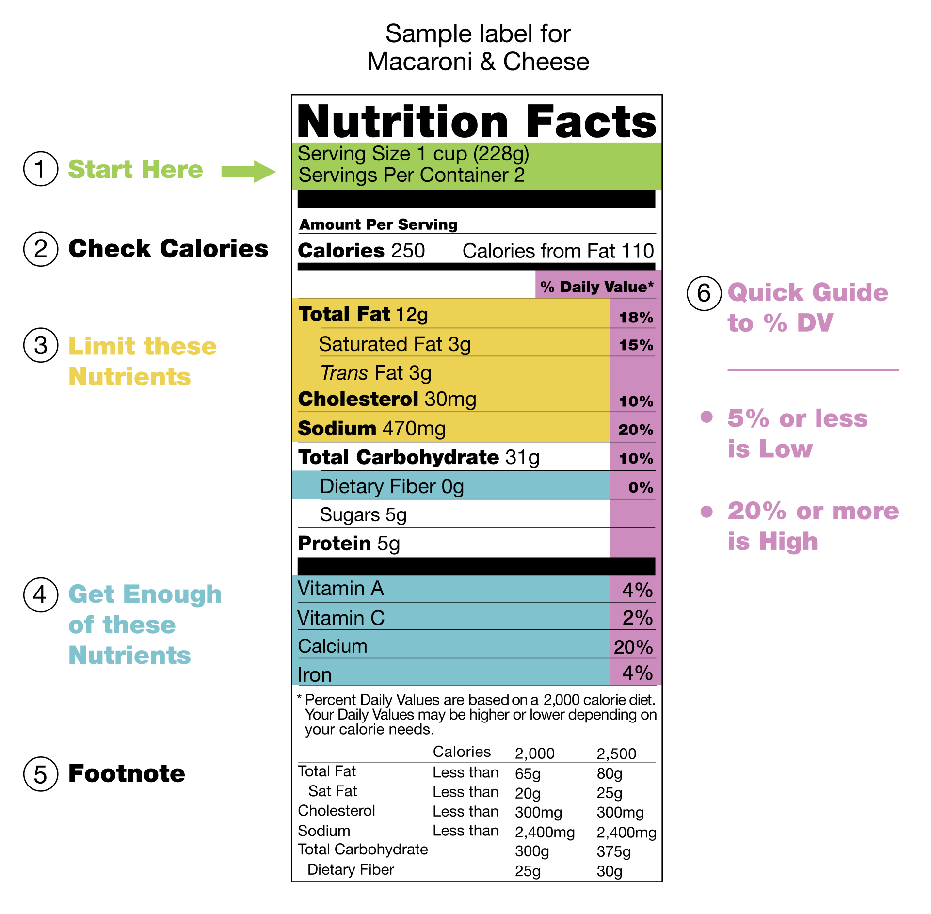
That label design has it all: hierarchy of information, facts that must be present, and a system that’s easily grokked. (And for anyone who gives a shit about this sort of thing: It’s one of the few evergreen designs in modern North American culture still propped up by Helvetica. Shout-out to NYC subway signs.)
I know it’s all I’ve spoken to so far in this post, but, I swear, it’s not the website redesign I want to share but rather that conviction the label has given me that I want to dig into: where it comes from and the impact it’s had on my creative process. As ridiculous as it may sound right now, it might resonate and inspire you, too.
To get there, it helps to understand a bit of its history.
James Burkey Belser
The nutrition facts label as we know it didn’t come from a designer. At least not at its inception. It was a North American regulatory story before it was a design one.
“Oh sick. Everyone loves a good regulatory story” - you, right now, and not sarcastic at all.
It came from decades of law, failed voluntary standards, and political pressure. The FDA had prescribed a voluntary format as early as 1973. Calories, macronutrients, recommended daily allowances. Manufacturers could comply or ignore it. Most did what was convenient. The result was a patchwork with no common standard, whatever typeface, whatever order, whatever claims served the product. The Nutrition Labeling and Education Act, signed in 1990, ended that era. It mandated standardized nutritional information on nearly all packaged foods. Nobody had designed the thing yet, and there was no budget to do so.

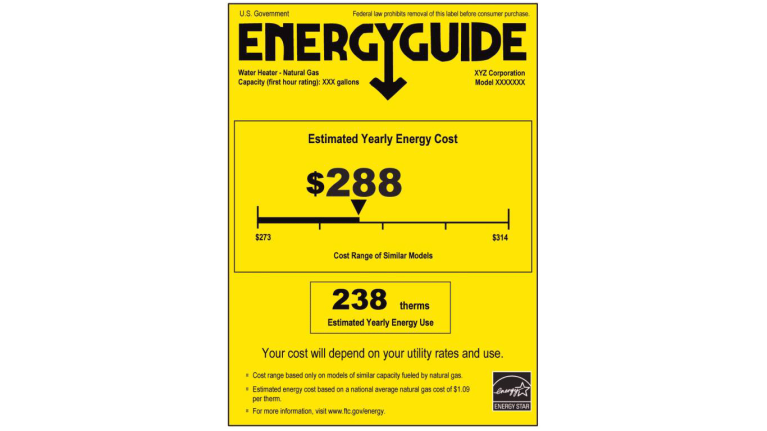
A Washington D.C.-based graphic designer, James Burkey Belser (1947–2023), took the job for free. Once dubbed the Steve Jobs of information design (seriously, and I know), his firm had a reputation for making complex information accessible. He’d previously designed the yellow EnergyGuide label on home appliances, and when the FDA came to him with this problem and no money, he offered to solve it anyway.
What followed was roughly 35 iterations, focus groups, and a central revelation that shaped everything: Poor readers stumbled over commas and semicolons. Graphs and pie charts assumed a level of visual literacy that couldn’t be guaranteed. Colour was ruled out. What emerged was a design philosophy built entirely around universal access. No punctuation, no icons. Typographic weight and position did all the compositional work. Helvetica was a choice made because of its lack of personality or dominance. Even the typeface stepped aside for structure and system.
The label went into effect in the United States in May 1994. Canada followed in 2003 with its own mandatory version, bilingual by requirement but built on the same design DNA. The thing Belser produced for free, under those constraints, would go on to become one of the most successful and widely used graphic designs in history.
If this is a topic you think you’d want to learn more about, I can’t recommend Xaq Frohlich’s From Label to Table enough. It’s a scholarly history of the label from a historian of ‘science, law, and markets’ concerning food risks & responsibilities. It’s an incredible breakdown of the history of the label and the policy that brought it to fruition, and affirmed a lot of what I felt with the label’s design itself.
A Work of Art
Pick up anything in your pantry with a nutrition facts label and look at it properly for a moment. Not to check the sodium or count the calories. Just look at it. Or at least imagine one for a moment in your head.
At the top, “Calories” is set so large it’s almost aggressive. Below it, a cascade: Total Fat, Saturated Fat, Cholesterol, Sodium, each one indented or weighted to signal its relationship to what came before. Sub-nutrients tucked under their parent categories. Thick rules separating the major sections. Thin rules dividing the minor ones. At the very bottom, in the smallest type on the panel, sits the footnote. The information that matters least lives furthest from your eye.
Belser’s design bring hierarchy and clarity to the information starting in 1993.
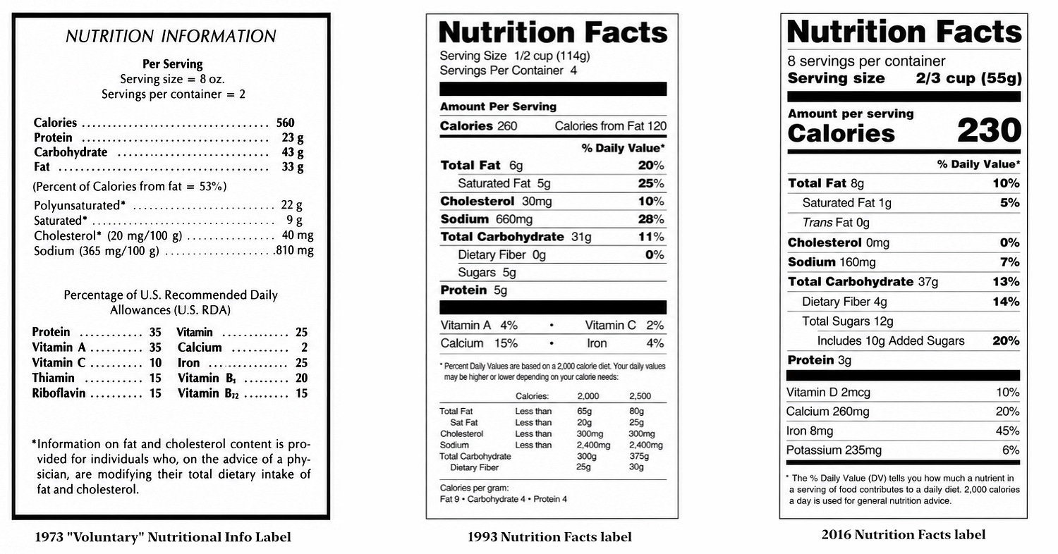
Every decision on that label is doing load-bearing work. The massive calorie count isn’t large because someone thought it looked good. It’s large because it’s the first thing most people need to know, and the design makes sure they can’t miss it even in a two-second shelf scan. The indentation isn’t decorative. It’s a relationship map. Saturated fat lives under total fat because it is a component of total fat, and the layout makes that relationship legible without a single word of explanation. There’s no colour, icons, or punctuation anywhere on the panel. Nothing that doesn’t earn its place.
That’s hierarchy-first design. The broadest truth at the top, the minutiae at the bottom, and every visual tool in service of moving the reader through that information in the right order. The design doesn’t require you to interpret it, you just naturally move through it.
It’s beautiful.
What I find compelling about this, and what anyone can miss if they’re not weirdly interested in this kind of thing, is that the discipline is exactly what makes it beautiful. The label isn’t beautiful despite having no decoration. It’s beautiful because it has no decoration. Every weight shift, every size decision, every rule is structural. The result has a kind of integrity that purely aesthetic decisions rarely achieve. There’s nothing to second-guess, nothing that feels arbitrary. It looks the way it looks because it could not look any other way and still do its job.
That’s the thought that keeps coming back to me when I’m deep in creative work. What are the limitations that need to be true and how do we design in a way that is true to them?
Top Down
I find myself asking that question constantly as a creative director. “What needs to be true here?” What are the systems that have to hold before anything else gets built on top of them? It sounds simple. In practice, for me, it’s the most important discipline in creative work, because the pull toward the exciting surface layer (the bottom up) is always stronger than the pull toward the unsexy foundation (the top down).
Someone I’ve known and had tremendous respect for as a designer since our time together at Polycount, Wolf Bōese, is a graphic & type designer whose work you’ve almost certainly encountered without knowing it. He designed the Astroneer wordmark, icons for chess.com, and a body of typefaces that carry his signature approach: hierarchy of information above all else. Weight, size, position, composition, all of it in service of getting the reader to what matters in the right order, without decoration getting in the way. I think about his work the same way I think about the label. Same philosophy, different medium.
That philosophy is the one I try to bring to sandbox game design. A sandbox is a system or group of systems that players must learn, inhabit, and exploit. The word exploit is important. It implies the system has rules that can be learned, tested, and bent. Players can only do that if the system is internally consistent. The rules need to hold. What the player is told is true must actually be true, whether they’re experiencing it directly or not. That’s the kind of sandbox I’m trying to build. Not just a system that holds, but one that’s naturally playful, that players can inhabit together and find their own way through.
In Astroneer, players build bases, extract resources, and reshape planetary terrain. The systems that govern how that works, how terrain is created, how resources are distributed, how power flows, how modules work and behave in connection with one another, had to be the foundation everything else answered to. Not necessarily completed first, but established as the truth the rest had to serve. The UI, the interactions, the visual feedback, all of it in service of what the systems were actually doing, not the other way around. The label has its calories at the top not because it looks good there, but because that’s what’s most true to how people use it. We put the terrain system at the foundation of Astroneer not just because it was the most exciting thing to ship, but because nothing else could be true without it.
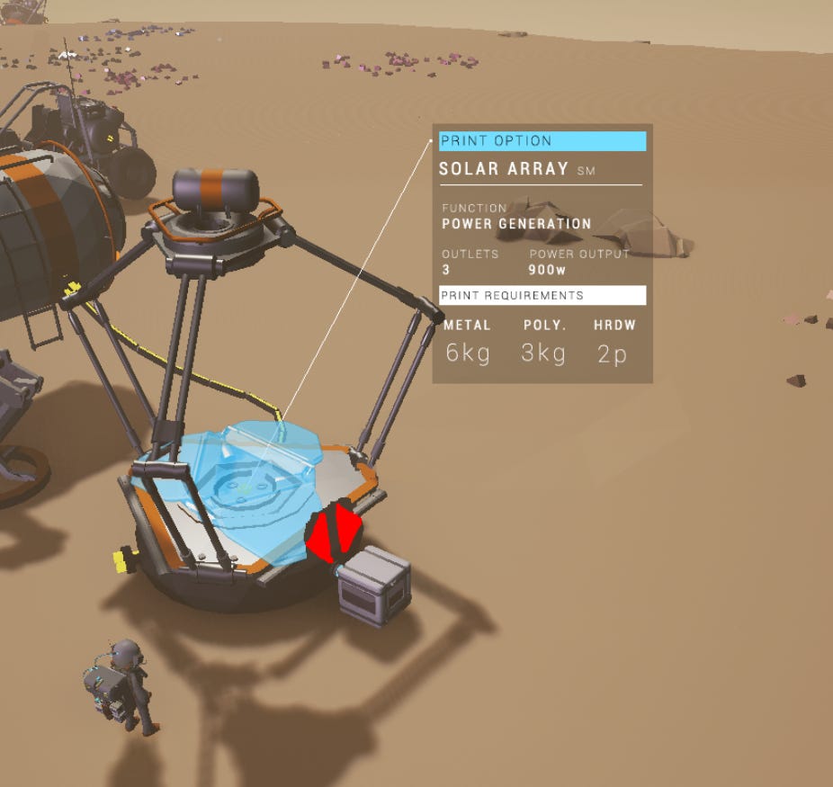
One of the most direct examples is how we think about weapons. Starseeker will have combat, but we don’t put purpose-built weapons in the game, nothing designed exclusively for harm. Instead, it has a myriad of what we call action-science tools. “A hammer is a tool until you hit someone over the head with it.” is something I’ve said with the team often over the years. That distinction of hard limitations shapes everything downstream: the visual language of items, their “tools-first” designs, the VFX treatment of their actions, how that colours the tone of game and encounters, and all the way to the themes of the narrative and objectives.
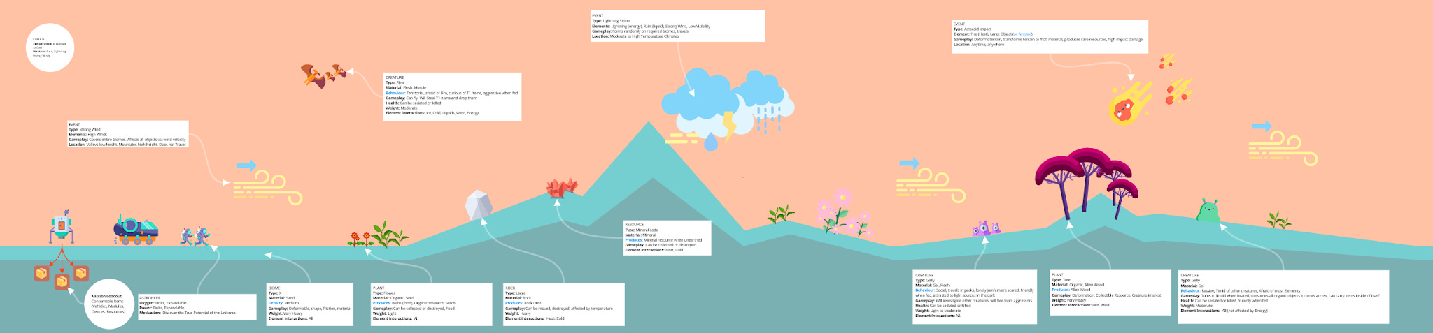
The systems themselves follow the same logic. Early in development, I demonstrated to the team how we needed to think about the sandbox so players could intuit how to play with it. Objects had weight. Materials had properties that reacted to elements. Everything had associated data. The gadgets would be designed to engage with those systems. The sandbox can never be one designed only for player intervention. The planet is doing its thing whether you’re there or not. Players deploy gadgets onto planetary surfaces to engage with systems that exist and evolve independently. The player is reading the label, figuring out what’s true, and making decisions from there. That hierarchy has to be established and understood so players can see it, know it, and treat it as (nutritional?) fact.
All of this is to say that none of this is unique to games and the label keeps reminding me of that.
What the label demonstrates is that constraints are not the enemy of good design. They are the only thing that forces good design into existence.The patchwork of voluntary labels before 1990 proved that. When manufacturers could do whatever served the product, they did. When the constraint arrived, when the information had to be true and the design had to serve every reader regardless of literacy or language, something unexpectedly beautiful came out the other side.
I think about that often. Not just in games, not just in the systems I’m trying to build, but in whatever creative work I’m in the middle of.
What needs to be true here?
What is the constraint I can’t design around, only through?
The most interesting work lives in the answer to that question.
Adam Bromell, June 2026
Head to my website for learn more about me or to find my socials, my photography, and my blog.
Subscribe to my Substack directly below.